From statements like “Web design is dead,” “Web design is not dead,” and “Software as a service will destroy web design as we know it,” to chatting with my wife about how she hates Squarespace and even touching the design of websites no matter how easy it’s made with website builders, it’s clear to me: Web design is alive and well, needed, and growing into a new mature realm in 2017.
A little back story; web design trends have oscillated from gradients, shadows and animations to simple white space with clean flat designs and back again. Trendy design has been including meaningful transitions, drop shadows and gradients again in the last couple years with Google’s material design and its influence.
Here’s an example of the evolution in interface design
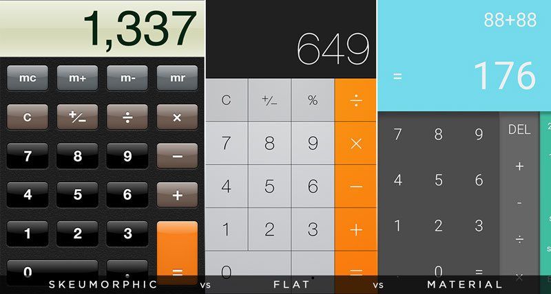
Notice that the shadows and gradients on the Skeumorphic design are intended to appear as a physical item – the Flat design version took that away. Material design adds in some shadows and gradients, but it’s not intended to make anything look more like a physical item. Material design intends to just give some visual clues as to the function and meaning of the different parts of this calculator design.
A greater emphasis on “mobile first” design: 2017 is the first year that will start with mobile traffic greater than desktop
What is mobile first? Well, it means designing with the phone, tablet and phablet as primary devices rather than the desktop. Now that traffic on mobile devices just surpassed desktop, it actually makes sense to prioritize mobile design more than ever.
Meaningful transitions: Interstitials
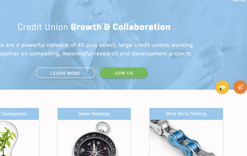
Notice the clear indication of a click on the button and the gradual appearance of the modal window – it’s not abrupt. These types of effects and transitions are added in Material design and the like because: A) They are easier than ever to implement in web design; and B) They help make people comfortable because their actions show visually how they’re taking effect immediately, but aren’t so in-your-face.
Overlapping grid systems
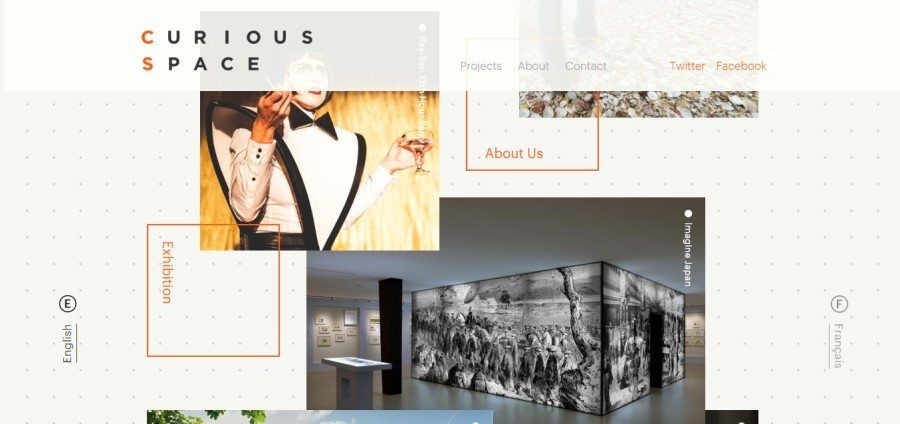
Geographic shapes in branding and symbols/icons have been making a comeback for some time, but they are now finding maturity on the web as a way to break up a page as well as break some visual patterns without creating an entirely new visual library. It’s fresh but not too out of the ordinary as to be distracting.
More customizations for particular demographics like “age-responsive web design”
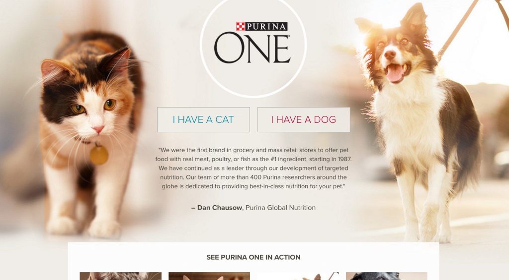
Imagine clicking an icon for “Kidify” on a toy website or clicking either “Cat Owner” or “Dog Owner” on a pet-related website. Suddenly every message can be more personal than ever. We’ve made our websites responsive to the size of the screen, now it’s time to bring in new dimensions and more tailored experiences.
Centered and split content used to draw dichotomies
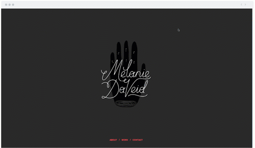
So many awesome websites are using this design convention as it does create a nice immediate visual balance, and you can play with it in terms of motion by allowing only one screen to scroll at a time. It’s not just a gimmick, though. It can also very quickly allow you to let someone personalize their route through your website by choosing one of two routes like the example below.
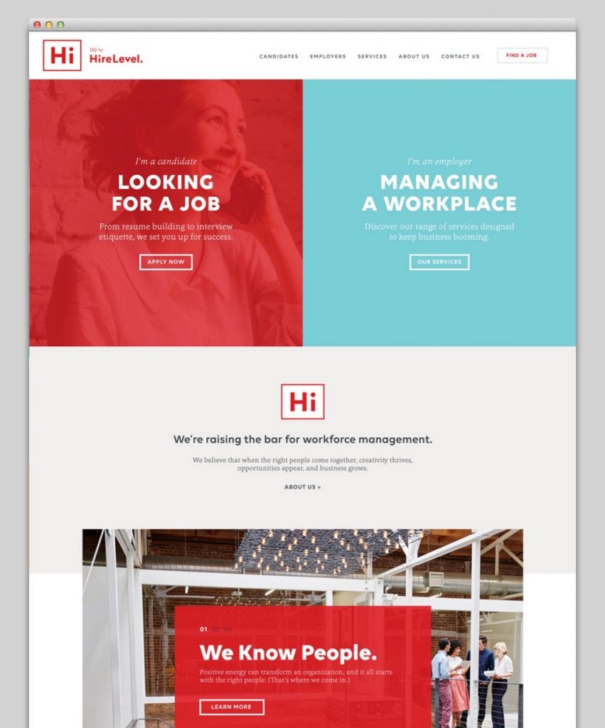
A comfortable goodbye and more emphasis on offboarding
Do you ever think about how your company looks in the rear-view after delivering your product or service? Well, you should. Pay attention to these seldom-considered details and you’ll be better set up for a returning customer or a rave review. It’s also a great place to give them the upsell like the example below.
Thank you for checking out our take on “2017 Web Design Trends” and please feel free to share what you feel will be big in 2017 in the comments below!