404. It’s not the end of the world, it’s just the end of that particular link. Somehow, your visitor managed to land on a page that has been moved or no longer exists. So, if you’re the owner of a website, you should put a little effort into customizing your 404 page design so it doesn’t put a damper on your visitor’s browsing experience.
Let’s jump right into some real-life examples and analyze what works doesn’t work well and what does.
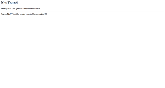
First up, the worst 404 page—the plainest and most unhelpful—a standard 404 given by a server that hasn’t been instructed to serve anything else:
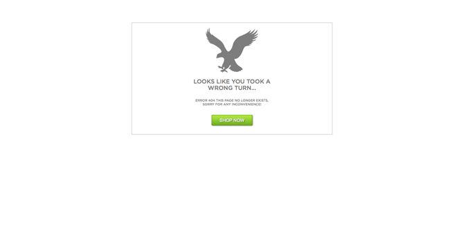
The second worst 404 page design. This company is trying to be clever with a funny graphic and quirky message, but it’s frustratingly unhelpful as well. There’s no main navigation menu or search bar to work with; the user will have the click the back button and start over. Not to mention it makes them look terribly unprofessional and immature.

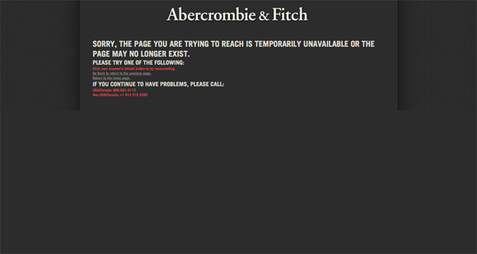
Two more examples of a similar caliber: American Eagle & Abercrombie and Fitch. At least these companies give you link to click, but consider the user’s experience at this point—it’s no different than if they had to click the back button!
Now, let’s consider ways to optimize your 404 page that will improve your user’s experience.
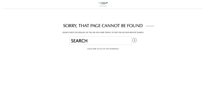
First example, Aston Martin. They are on the right track here—minimize all distractions and focus on the search bar. The user will type a word or two of what they’re looking for and hopefully land in the right place the second time around. The drawbacks? Aston Martin needs to be really sure that their search bar works well and the user will find what they are searching for.
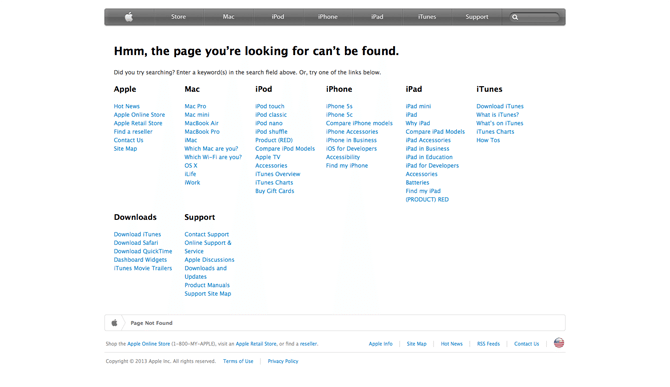
Ideally though, a company ought to have a search bar and another method of navigation: and this is where a site map comes in. A great example is Apple—they keep their 404 page simple and to the point. They offer a short message stating why the user is here, and give them two alternatives for finding the right place. While Apple’s REAL site map is probably much bigger, they only supply a high-level site map of their most popular pages. Statistically, one of these pages will be the answer their visitor is looking for.
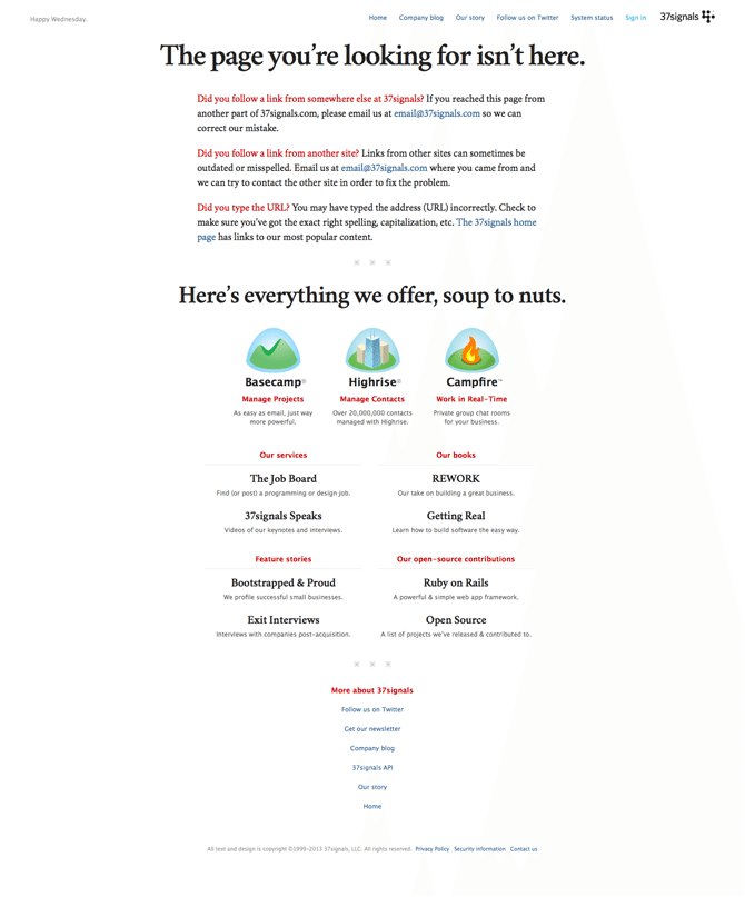
Finally, my favorite 404 page is served by 37 signals. Their one drawback is they don’t have a prominent search bar, but they can probably get away with it since their site isn’t as big as Apple’s. Why is this my favorite? Because right away, they are troubleshooting the 404 error. Notice their copy: “Did you follow a link from somewhere else at 37 signals?”, and “Did you follow a link from another site?”. They offer an explanation of the error and give the user specific steps they can follow to solve the problem. Their subsequently well-designed site map is just the icing on the cake.
Finally, the ultimate solution is to avoid the 404 error altogether. The best way I have found thus far to prevent such a travesty is to download the free software, “Screaming Frog”, which is an SEO spider tool. This tool will crawl the first 500 pages of your website and check for any errors. It will pinpoint any 404 errors, and therefore give you the clues you need to take preventative action.
If this article was helpful for you, consider contacting Snap Agency to assess your 404 issues and design a custom 404 page for you.
Happy 404-ing!
