Web design plays a considerable role in shaping a customer’s perspective of a brand, and it’s no different in the case of manufacturing businesses. After all, a well-designed site suggests an equally attractive brand as well as a positive customer experience.
What are some straightforward ways to polish a website’s design, especially when it comes to promoting your manufacturing business? Read on to find out.
Typography
If your manufacturing business wants to convey a particular tone, persuasive typography is an excellent way to do so. Studies show, for example, that Baskerville and Sans Serif-type fonts are some of the best for conveying trustworthiness and ensuring reader comprehension. Even more so for manufacturers, a relaxed, friendly, ultimately professional-looking font is best for sharing that no-nonsense subject matter.
Case-in-Point: Bryden Apparel
Bryden Apparel’s goal is to make “quality clothing manufacturing easy and accessible,” and their typography undoubtedly supports that message. The clear, evenly-spaced lettering and Sans Serif font exude quality, simplicity, and affordability, all at once. Just as remarkable, the site’s headings and subheadings are sized deliberately, creating a calming, consistent web browsing experience.
Readability
Whether you’re a food and beverage manufacturer or you supply other B2B companies with essential industrial materials, your customers are likely looking for a functional web design that suggests stability, reliability, and meticulous attention to detail.
You can convey all of these things, and more, with a simple, easy-to-navigate page. We’re big fans of the minimalist approach for that very reason (just make sure you don’t have too little information on your page at the same time).
Case-in-Point: Graco, Inc.
Graco, a fluid-handling system manufacturer, is a prime example of readability done right. We’ve talked in previous posts about how minimalism is one of the hottest web design trends in 2020; Graco balances their site’s white space and vibrant pops of color—blues and yellows especially—with aplomb. Graco’s Customer Service, Careers, and Top News sections contain short snippets paired with pictures in neat columns, with a convenient “read more” section for articles that pique your interest. In other words, the company covers many bases on their homepage alone without info-dumping entire articles and overwhelming the casual visitor. For these reasons, we’re inclined to believe that they really do follow through on the “A+ customer service” and reliability they promise.
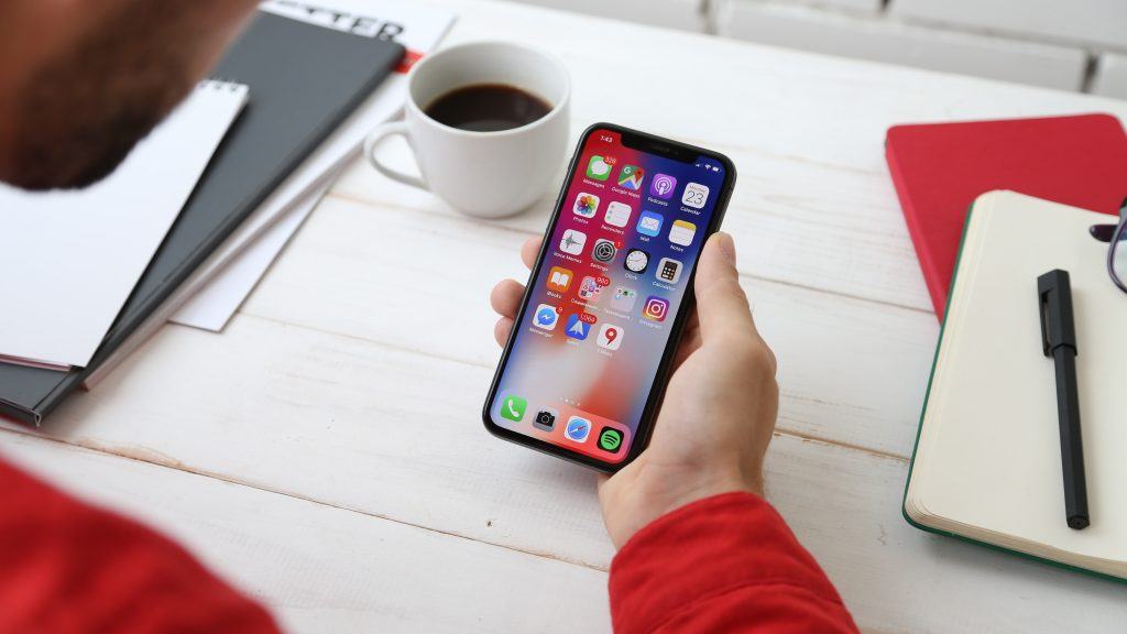
Mobile Compatibility
As of 2020, there are 211 million mobile searchers in the U.S. alone, so hopping on the mobile bandwagon is crucial for every business looking to strengthen their digital presence, including manufacturers. Some quick ways to achieve mobile compatibility include: reducing the number of images (and image sizes) on your site, caching regularly, and improving your server to send that manufacturing data more quickly to consumers.
Case-in-Point: John Deere
A leading manufacturer of agricultural, forestry, and construction equipment, John Deere ranks high with us for its mobile-friendly experience. Enlarged images doubling as links take the place of lengthy text posts, and what text is available is clear and easy to read. What’s more, the mobile site’s web pages load quickly, making on-the-go equipment research a breeze. Perfect for those who are, say, hard at work outdoors or on the move between job sites and opt for a mobile device over a personal computer.
Color Palette and Imagery
Color scheme matters in web design for manufacturing—no ifs, ands, or buts about it. It’s a way of guiding a viewer through your site in a natural, unobtrusive, and engaging way. The right color lineup can lead a viewer’s eyes down a page just so (or wherever you want your viewer to look first), and it excites the mind just as much as it does the eye.
Consider color psychology. If you’re a manufacturer who wants to emphasize an enthusiastic, friendly brand voice, shades of orange are the way to go. Then again, maybe you want to convey stability, authority, and reassurance (think medical device manufacturers). In this case, green and blue are your best friends.
Case-in-Point: The Manhattan Toy Company
We love the soothing pastel color scheme of The Manhattan Toy Company’s webpage—just as whimsical and nurturing as their products. At the same time, a simple design and clean typography tie things together and create a professional feel that will have retailers heading straight to their wholesale information page.
Web Design for Manufacturing With Snap
Are you looking for a partner in digital design services? Look no further! Here at Snap, we’ll utilize stunning typography, aesthetically-pleasing color schemes, readable landing pages, and a mobile-friendly approach to make your manufacturing business stand out. Don’t let this essential part of your company’s foundation slip by the wayside—come talk with us today!