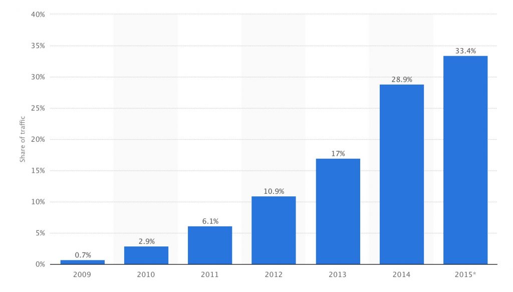
Responsive web design is not a new concept anymore, it’s been around for 5 years now, but some companies don’t seem to have an urgency about their mobile strategy. After designing responsive web design in Minneapolis for several years now, Snap Agency has learned what a solid mobile website can do for a company; and quite recently have converted some websites to responsive design that had previously been desktop only, and were tracking the revenue – so we see how providing a mobile responsive site can drastically improve your odds of making a sale for the now 35% of web traffic that is coming from mobile devices now.
Now into the juicy stuff – Examples of How Responsive Design Improves Conversions
1. Time Magazine relaunched with a mobile responsive website design and promptly received a 25% traffic increase.
Not only does Google recommend responsive design, according to EConsultancy Time Magazine would too, as once they redesigned with responsive they had higher traffic, but also a lower bounce rate. Imagine you land on a website while browsing on your phone and you have to pinch and zoom; you likely are going to spend less time on that particular site as navigation is hard, and unless the content is absolutely incredible you can likely get similar elsewhere in a more easy to use fashion – at least on mobile.
Take-away: People want to read content that fits their device, make navigation simple and don’t make them pinch and zoom.
2. Online retailer Skinny Ties launches responsive site to 71.9% increase in conversions on mobile.
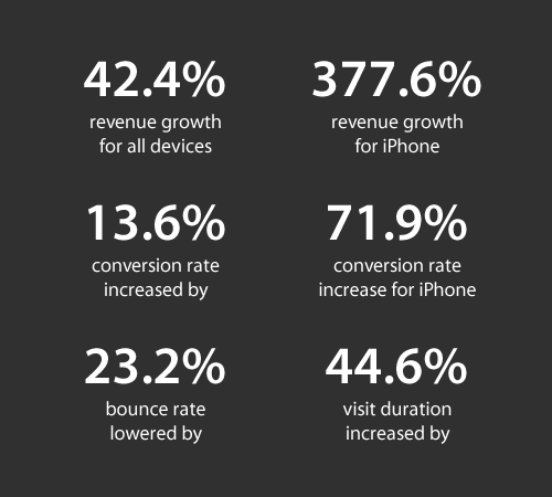
Skinny ties didn’t do a grand launch for their new site, just quietly launched the new site to see how organic traffic and conversions changed from the new responsive site. Creating the Magento website, the agency who worked on the project measured dramatic results as evidenced by these numbers. See the case study here.
Take-away: Responsive design isn’t some “nice to have”, responsive design can make people significantly more likely to press add to cart and check out on your eCommerce site – Utilize Magento for heavier eCommerce sites for security, stability and performance.
3. Schofield and Sims, an educational publisher, had an increase in revenue on mobile of 73% after upgrading to responsive design.
I love looking at how design changes affect revenue. With A/B testing you can serve multiple designs up, alternating visitors and see which one does best. Connecting this to revenue tracking can make a profound statement on how good design can sell stuff and should be respected. Sometimes, as in the case of this educational publisher – the real improvement was just accessibility: people could see things more clearly with responsive design and could get where they wanted to go with more easy (sans pinch and zoom,) and thus it equaled more revenue.
Take-away: Responsive design doesn’t just give you more traffic, it means more money in you and your company’s coffers.
4. Wal-mart got a conversion boost of 20% on all devices with a responsive design. On mobile, orders went up by 98%.
Not only did Wal-mart receive a boost from responsive but also paid close attention to site speed by highly caching the site and allowing the site to keep things quick. Conversions went up, and mobile orders almost doubled. That’s incredible. For one the nation’s largest retailers that responsive web design could have that kind of incredible effect on conversions.
Take-away: Even large retailers bottom lines can have dramatic shifts with a combination of responsive design and close attention to page-speed – Utilize caching.
5. Debt Management company Baines & Ernst implemented responsive design and average visit duration has risen 30% while mobile conversions have grown an impressive 51%.
This case study was written on Think with Google, so that tells you how much Google respects and how they treat responsive sites. Google recently updated it’s algorithm to favor responsive sites – because it knows people favor them. We should state that Baines & Ernst not only updated to responsive design but implemented a user-focused design strategy that really made things easy to get to and consistent across devices.
Take-away: Updating to a new responsive website should not only be about making it mobile-friendly, but user friendly as well. User test with 3-5, or more people before your redesign to get feedback about how to make the site easy to navigate and the most important things easy to get to.
Design changes things, accessibility changes things. Let people get at you in any scenario and make sure your site looks nice on mobile devices and they will thank you with more sales and more contact submissions if that’s a key performance indicator for you. Not only that, but having a responsive website now affects your ranking in Google. If all that isn’t enough for you to invest in responsive design, I’m not sure anything will.