Button color or CTA (call to action) color and hierarchy is important because it can increase sales and contributes to increased revenue. Being a web designer I appreciate just how much thought goes into good design. This thought process includes color theory and how it will behave with a specific target audience. While one specific color doesn’t outperform every other color out there, I do have tips on how to find the color that will work best for your web design.
Why is button color important?
CTA buttons need to have hierarchy because you want people to know what to do next. One button and one action have to stand out and look different then everything else on your page so people don’t have to think about it. What are most people going to your website for? Whatever that thing is, it should be your main CTA. Every other secondary action needs to be exactly that, tone it down and make it clear to the user that it is secondary. Doing this aligns your conversion funnel to be more focused, getting you more conversions and ultimately more money.

What color grabs the most attention?
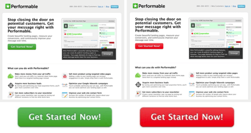
High contrasting colors grab the most attention. This could mean any color from black, white, green or red. This decision will always be dependent on the rest of design. For example, if you have been using a green button as your main call to action on your website but notice you have other green design elements in your web design chances are you could increase your conversions by changing the button to red. I have seen this change in action from the results of A/B testing at Snap Agency and in this post from blog.convert.com. In the example they use in this post an increase of 31% happened when they changed their button from green to red.
Understand, these results are dependent on the rest of your web design. Make things simple so people don’t have to think but don’t be loud or in their face. People are smart they just don’t have time, so everything about your design needs to be intuitive. The aim for your interface needs to be simple, quick and clear.
Michael Aagaard on Content Verve talks about an increase of 30% when using first-person vs. third-person on CTA’s. This needs to be considered when designing your buttons as well because it is clear it definitely leads to better results.
How do I know if it worked?
A/B testing is one of the best ways to implement these changes. A/B testing basically compares two different versions of a web page. This takes the guesswork out of improving your website and allows you to in end reach your goal. After the experiment is over you will be left with the analyze results and can see the difference in your numbers. A good reference for A/B testing software is Optimizely.
To review your CTA button color needs to be contrasting of the rest of design. Doing this will naturally set this action apart from the rest of the design elements on the page. Stay simple when changing the look of your buttons. Don’t be too loud or in their face, remember people are smart they are just busy. Your interface design should be intuitive and your CTA’s should be simple. Lastly, use first-person instead of third-person language this will contribute to stronger conversion rates.