Mobile plays a large role in today’s digital landscape. In most fields, the majority of traffic conducted across the web is performed via a mobile device. And yet, many businesses fail to realize the importance of having a mobile-friendly website. Visitors want to have the same level of experience on your site regardless of whether they’re on mobile or desktop. If your site can’t stand up to the test then you’ve got a serious problem.
At Snap, we’ve been making websites for over 13 years, and we’ve been aboard the mobile train since the advent of the smartphone. Every member of our digital team knows the importance of mobile design and advocates its value to all of our customers. With a focus on human-centered designs powered by data-driven insights, we use the following tactics to craft unique responsive websites.
The Discovery Process
 When starting from scratch, or even if you already have a rudimentary website, it’s important to go through a thorough discovery process. At Snap, we use our web build discovery process to accurately define our project deliverables, align ourselves with our client’s needs and expectations, and determine the best ways to achieve mutually agreed upon key business objectives. The discovery process is composed primarily of four phases, a requirements gathering session, and research, documentation, and solutions phases.
The Requirements Gathering Session Phase
The requirements gathering session involves an in-depth exploration of the functional requirements of the project acquired through stakeholder interviews, research, observation, and gap analysis. The data we gather is extrapolated and translated into formal sets of requirements that ultimately inform a comprehensive set of deliverables to guide your web build project. The requirements gathering session can also include whiteboarding sessions and targeted demographic user testing and stakeholder interviews when called upon.
The Research Phase
The research phase of the technical discovery process is imperative to the overall success of your web build project. Our technology team will review all data that’s been gathered concerning the requirements for the project, as well as the existing systems in place within your infrastructure to ensure that our team has complete mastery over your business and services. Our research is then broken into two facets: processes and systems. Each facet has its own unique execution, but each ends with the Snap team walking away with a deeper understanding of your website’s needs and capabilities.
The Documentation Phase
The documentation phase of a technical discovery involves formally and accurately documenting all data acquired through the requirements gathering process and information collected and applied in the research phase. All requirements are defined and expounded upon in both layman’s terms and in technical detail, rich enough to allow for the use of this documentation for identifying the full scope and scale of the project, along with the resources and timeline required to execute on the project.
The Solutions Phase
 Within the final step of the discovery process, a solutions proposal document is created. The solutions proposal document incorporates all of the information gleaned and gathered during the requirements, research, and documentation phases. The proposal includes clearly defined recommendations on technology solutions that accommodate as many of the requirements for the project as is possible. With this document, it is then possible to create milestones for deliverables, apply them to a realistic timeline, and accurately define the effort and budget required.
Building Your Website
After we’ve concluded the discovery phase, we move onto the next four stages of building a responsive website; information architecture, design, development, and launch. Our approach is this extensive so that we can ensure that your brand is represented in every aspect of your new website. But have no fear, our approach is a collaborative one. We like to work side-by-side with our clients to ensure success through every stage of development.
Information Architecture
Once your discovery is completed, it’s time to start designing the infrastructure of your website. When we talk about information architecture, we’re referring to all the technical and aesthetic aspects of your website that will play a role in determining the best functionality for your visitors. As with most things; having a bulletproof plan in place before we begin actually building your website is crucial to the project’s overall success. By focusing on UX and UI, our team will help you to create a sitemap that addresses all of your wants and needs. We’ll make sure that everything is in the right place to maximize your website’s conversions before we move on to design.
Design
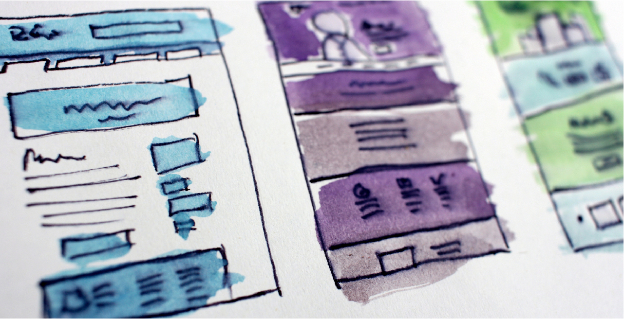 The information architecture phase is the more strategic of pair when compared to design. With its primary focus geared towards identifying and optimizing target audiences, the design phase accounts for the visual aspect of your finished site. By following best practices, our team will create an aesthetically pleasing layout that will appeal to both stakeholders and visitors alike. And with the use of prototyping tools, you’ll be able to see the progress of your website every step of the way from A to B.
One vitally important part of the web design process is ensuring that you site will look beautiful on all devices before we hand our designs off to the developers. Our team knows that a responsive site has to have multiple breaking points to readjust and layout the page to still be beautiful, no matter the device. This means that while creating stunning desktop designs, we’re always thinking about mobile functionality. We embrace mobile responsiveness as a natural part of your website’s design; not an intrusion.
Development
Once design has concluded, your website will look great, but it won’t function quite yet. Its the role of our developers to bring the designer’s vision to life with well thought out functionality. You could say that designers create the vessel, but developers create the soul of your website. Once the designs are handed over, our developers get their hustle on programming your new site. With custom code that’s been built for maximum responsiveness, we’ll ensure that every functionality has been tested and retested to meet our high standards before we sign off on anything. This included ensuring that every feature is 100% responsive and will function just as well on mobile as it will on desktop.This includes testing your sites performance and functionality on multiple browsers and devices.
Launch
After development comes the really exciting part; launching your new responsive website! Between your team and ours, we’ve all spent hours upon hours getting your site ready to be seen by your customers and supporters, so it’s time to finally let your website spread its wings and fly. Of course, our developers will constantly be monitoring your site for issues or opportunities for improvement. By this point, we’ve done the grunt work to make sure that your website will be welcoming to both visitors and search engines alike, now it’s time to give your new responsive site the chance to succeed.
Build Your Next Responsive Website with Snap

A website is a digital extension of your brand, and often, it can be the first interaction a consumer has with your brand. At Snap, we love creating responsive websites for companies we can get passionate about. So whether you’re looking to freshen up an existing site or build something from scratch, our experts are standing by to help.