Imagine you navigate to a beautiful e-commerce store. Its sweeping visuals are matched by its tasteful animations, whirling you to the next promotion and sweeping you off your feet. You scroll down expecting to find featured items but see something a little different; an interactive video quiz. You’re a little thrown off, but it’s a fun site—it’s out of the box, it’s quirky. Parts of it even scroll horizontally, not vertically, and you marvel at the ingenuity of whoever made the site.
The stats would say that this design, with all of its novelty, will convert fewer visitors into paying customers than a website with the same amount of traffic and a greater level of “prototypicality.” Prototypical just means that things are where someone expects them to be. So perhaps you navigate around the web today and see a lot of the same patterns, types of navigation systems, a big billboard / hero image with two buttons urging you to “learn more” and “buy now” or “contact us,” and you’re thinking, “Wow! These blend together.” That may be the case, but the owners of these sites are likely to benefit from the fact that visitors generally know how to use their site.
According to Conversion XL, Skinny Ties had a darker, less prototypical design and moved to a site with much more white space and prototypical elements. It received a 42.4% increase in revenue over all devices after making the move to a prototypical design.
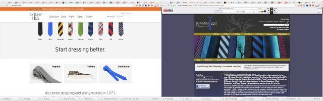
The new design is on the left.
“Working memory” is deployed every time something needs to be recalled in the short term. If your site requires people to use a lot of their working memory on the design elements, that working memory isn’t available for things like guarantees, descriptions, prices and offers, which is what we’d want them to be using it on. In short, we want people to focus on the content of the site and the core value proposition rather than some structural things or elements of the design.
According to Search Engine Journal, “Cognitive Fluency” means the brain prefers things that are easy to think about, and the “mere exposure effect” means we generally prefer something the more we’re exposed to it. To deviate from normal design patterns makes a site a bit harder to think about. If they come to a product page and the add-to-cart button is right after the logo, they’d likely have to wonder, “Why was it put there?”
If a visitor is asking questions about the design, there’s time wasted that could be spent gathering information, making decisions, and perhaps making a purchase. Keep an eye out for these three ways you can help keep a design prototypical:
- Look at where companies in a similar niche are placing their design components, calls-to-action, and key messages, and what pages they are including.
- Rely on your branding, key photographs, and any icons to carry the design: Don’t add unnecessary decorative elements.
- Keep the layout simple and give visitors what they came for quickly, rather than force them to sort through a lot of things right away. Then, progressively reveal more as they make initial decisions about what they want to see.
Overall, you should be striving for less. Aim for fewer frills with more meat and potatoes. Give the people what they came for and leave the search for novelty to your competitors.