A few months ago I read that Medium, the online publishing platform, invests in finding out how to create the best and most readable web copy. Since then, I’ve delved deeper into what exactly makes the secret sauce so I could use it when designing a website. Here are some things I’ve learned about employing typography in a way that’s deliciously readable for the web.
General principles of typography that will help you choose the right font for web readability.
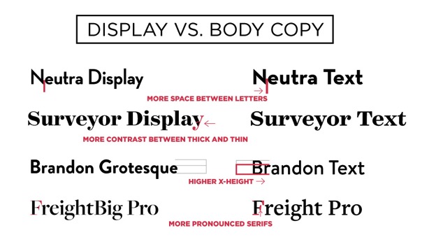
The first step to improving typeface usage is admitting you have a problem. Have you ever been so excited to use a fancy font that you used it for body copy? God forbid. Recently, there was such a clamoring for the font Brandon Grotesque that I started seeing people use it for paragraph text, and it’s not intended for that, let me tell you.
Don’t use a display font for body copy.
There is a difference, after all, between fonts that are designed for titles and fonts that are designed for paragraph copy. You can spot a display font when it has “Display” in the name and it’s particularly fancy or expressive. These fonts were designed expressly to be used at larger sizes. Many times the display font was designed first before the text fonts. Although it is an exquisite specimen, if you used it at smaller sizes, the contrast between thick and thin would makes it difficult to read and causes “dazzling.” In display weights, the x-height in the lowercase letters is shorter, serifs are less pronounced and letter-spacing is tighter. Although these are things you can get away with and even celebrate at a larger size, they could make for muddy illegible lines of text at a smaller size.
From The Best Web Typography Infographic
Use contrast to make sure subtleties are easy to see.
The background color of the text should be markedly different from the text color itself—not just in terms of color, but with hue or contrast as well. For instance, a medium-green font shouldn’t be on a medium-gray background, and so on.
What characteristics do the most readable on-screen fonts have?
In a previous post, Roger Black speaks about what makes a sans-serif readable on screen and he spoke to these points; wider width, open counters, open apertures, high x-height and sturdy thin strokes.
Let’s go into a bit more detail about these font factors and how these principles are extremely important on the web or on the screen.
Make sure the font is not too light.
Yes, you may love those thin versions of Proxima Nova or Gotham, but they really aren’t feasible or particularly practical for reading. Apple loved the sleekness of Helvetica Neue Ultralight—but the company ultimately switched to Helvetica Neue Light (a slightly heavier version) after having readability issues. When in doubt, opt for legibility over delicate weights unless, of course, the font is very large.
One of my favorite code-snippets for out of the gate for better web typography is ‘Better Helvetica’, which is a CSS font stack that takes the best version of Helvetica a website visitor has on their machine and uses it.
body {
font-family: "HelveticaNeue-Light", "Helvetica Neue Light", "Helvetica Neue", Helvetica, Arial, "Lucida Grande", sans-serif;
font-weight: 300;
}
Make sure the font has a high x-height.
As portrayed in the infographic above, how tall a font’s lowercase body copy letters are is somewhat tall, which will help with readability at smaller sizes.
Create the right spacing between letters for optimal legibility.
Obviously, letterspacing on the web does affect the readability of text. Use too much or too little and readability will be compromised. However, there are times when disparate letterspacing is needed. In the graphic below, you’ll see me add generous letterspacing to subheads or phrases of uppercase text. I find it’s easier to read uppercase text when the characters have some additional space around them. Also, depending on the typeface used, I like to increase letterspacing ever so slightly in setting body copy.
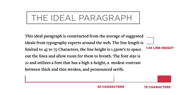
Creating the best reading experience with line-height and line-length.
The jury’s out for what the exact ideal font size for web is, but here are some averages for top websites that pride themselves on high typographical standards.
- Smashing Magazine suggests 16px and uses 19px in this article
- Medium uses 21px and the article “3 Typography Tips for a More Comfortable Read” on suggests 22px
- 37Signals’ blog Signal vs. Noise uses 22px font
- Zen Habits uses 22px
The height between your lines matters: Medium uses a 21px size font with a 1.58 line-height.
Other sources have suggested 1.6em or 1.5em, and Smashing Magazine has suggested 1.48 em. With the direction of body copy arching larger and with more space, I’m going to go with a high average of 1.55em as my personal suggested line-height.
From The Best Web Typography Infographic
Here’s an example of this look in CSS, although it should be massaged and matched of course to your specific web typography conventions:
.big-read {
line-height: 1.5em;
font-size: 21px;
letter-spacing: .2px;
}
Don’t forget the space between your letters, or letter-spacing, in CSS.
I’m not the first to extol the virtues of letter spacing. Vivian from “The Working Group” in California shows how 2px of letter spacing can make even the tiniest text still legitimate and legible.
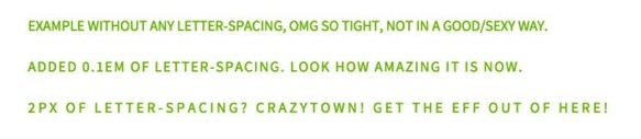
To increase the legibility for body copy, take a shot at increasing the space between letters. Legibility is very font-dependent, so do this with discretion and consider tweaking in-browser with CSS for the best results. Or choose a font that lets the letters breathe with a bit of space for a more pleasant reading experience. Web development and this kind of attention to detail isn’t as necessary because of the intention already paid to the typeface design in its inception.
Notice the line-length of your blog: How many characters deep is it? Smashing magazine suggests 45 to 75 characters.
Chris Coyier, author of popular front-end web development blog CSS Tricks developed a Bookmarklet to help make sure you are keeping your line-length in range. Simply drag the button from within the codepen onto your bookmarks bar, and when you press it, you can hover over any body text and the bookmarklet will outline the text in red if your text is within the suggest 45 to 75 character range—a very handy tool.
Remember to use bulleted lists and imagery to string the reader along and help convert.
Let’s face it; you aren’t writing on the web for your health, you do it to accomplish a specific goal. Even if that goal is to establish yourself or your company as an authority, and you want the reader to finish the article. On the web in particular– bulleted lists, imagery and video are proven to draw people in and keep them reading. People may skim your article looking for nuggets or to see if is worth reading; either way, help them draw out your most important points as they continue to read on.