Web design trends are always changing. Sometimes designers, who just started to learn a new technique or style, have to continually refresh their understanding of the art of effective web design and these design styles. Fortunately, despite the fact that everything flows and everything changes, there are some permanent tendencies that remain fairly stable and rule the roost.
2016 doesn’t promise to be incredible in terms of global changes, rather the opposite – it will be the year of strengthening of existing practical trends and slowly integrating more radical ones. Trends such as Google Material Design will re-integrate ‘skeumorphic’ (indications like gradients and shadows) that have gone out of fashion and make them fashionable again.
Our guesting author today , www.designcontest.com is taking a shot at predicting the biggest design trends of the next year and more generally within Graphic Design. Well, let’s unveil the mystery of both web-design and “general” design of 2016.
Handwritten Scripts
Fashion for handwritten fonts arose as a result of society’s response to products of mass consumption. Today’s products and materials are quite artificial, so people want something natural: food grown without pesticides, fabrics made of natural wool, solid wood furniture, etc.
Designers immediately caught this trend and began to use handwritten fonts in their projects. Look at packaging design and you’ll understand what we mean.
A handwritten script is excellent for decoration of farm products or limited edition product lines. Already used for some time rough and massive fonts will remain in the foreground in 2016. A sophisticated calligraphy will descend, since it doesn’t fit the trend for “ecological compatibility”. To stay on a wave crest in the next year, please use simple handwritten fonts.
Fashionable Colors and Shades
The desire to consume natural products makes designers to use “natural” colors and shades. These are green and brown shades, muted blue and beige… that is to say the colors that we can easily find in nature. The use of these colors in the design signals potential customer about the honesty, usefulness and ecological safety of the product.
Of course, consumer products niche is not the only place to realize your design ideas. Nevertheless, there’s no doubt that 2016 will be the year of low-key colors that have begun to dominate a few years ago.
The Interaction between Fonts and Objects
Not so conspicuous, but quite a popular trend. Today, some designers are experimenting with fonts and images, making spectacular illustrations. The technique when objects cross fonts, remaining readability of the image, will be popular in 2016. The key to success here is not to overload the picture with too many elements, as well as to use a simple font that is contrast to the image.
Vintage
The retro-style is still in trend, and there’s no reason it will descend in 2016. Elements of 70s and 80s are quite popular today, so boldly include them in your design projects. The era of stencils and airbrushing coming back again and makes the use of geometric elements in combination with the pale colors one of the main trends of the upcoming year.
Unusual Elements
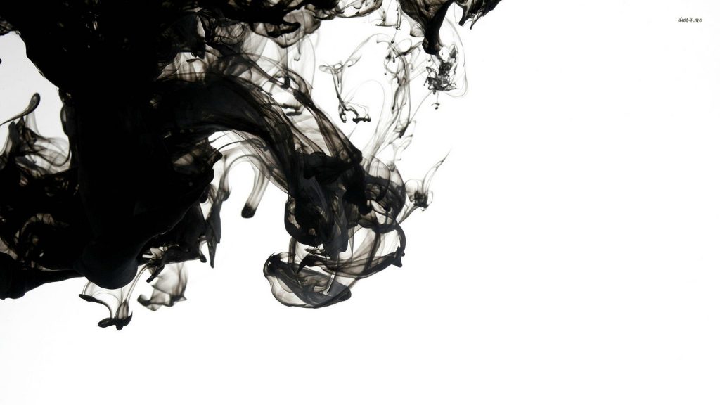
The best way to get away from the standard and boring design is to add the unusual elements like liquids and fumes. By adding a bit of abstraction in design, you can create a very vivid and memorable image. This trend is very common today and it promises to strengthen in future. Beyond a shadow of doubt we can claim that designers will continue to experiment with amorphous forms in 2016.

Low-key Gradients
Too bright and flashy gradients are no longer in trend. Most designers prefer to use very simple and subtle gradients. Minimalism is a key. The trend for low-key gradients came from the web along with flat-design. However, gradients are needed in graphic design to give the image volume and “depth”, so you just have to refuse “screaming” colors.

Flat design
It’s the ideal solution not for mobile phones only, but for the whole electronic devices in 2016. Flat design provides clear structure and position of a page; moreover, it could be based on visual metaphors, bold charts and some important movements. The mixture of flat design with photography can make a nice contrast.
Infographics
You know, the world is getting simpler, so one of the prior tasks for today and for the future is to present information in “ready to consume” form. Infographics copes with this task perfectly, since its main advantage is ease of information perception. Infographics are quite entertaining, but it became so popular that to stand out from the crowd you need to make it as creative as it is simple. Check out some examples here on how pretty infographics should look.
Ghost buttons
Efficient use of space is one of the key chips of the coming year. Ghost buttons are transparent (at least semi-transparent), so they visually increase the space. These buttons are often placed in the center of a screen and contains a call to action. 2016 is coming to be the year of ghosts! Boo!

Other design trends 2016
The creation of identity is perhaps the most complex and demanding task of graphic design. To stay ahead of competitors in 2016, you need to consider many factors, both time-tested recommendations and modern tendencies conditioned by proliferation of mobile devices and fashion trends.
Development of corporate style and logo is a process in which you have to account the peculiarities of interfaces and websites. For many years we have seen how they require simplicity and flexibility. Graphic design is quite responsive to new challenges and trends in related fields, whether it is illustration or web development.
So, what is the trendy logo in 2016?
(Overall – shoot for stylish and powerful over ‘trendy.’)
- Simple geometric shape.
- Handwritten text – cute and somehow sloppy.
- Hidden concept of a brand – impressive but simple to guess.
- No hyphenation and dashes – just splitting into pieces and stacking in a right form.
- Conceptual use of negative space instead of piling up of complex elements.
- Minimum of bright colors.
Sure, this list is far from complete – we can recall vintage design, gradients and some other stuff, but minimalism really rocks.
The increase in the number of devices with different screen sizes dictates brevity, simplicity, and even weightlessness. To look good both on a website and on a billboard, a logo should be well-thought, clear and adaptable. And the most eloquent argument here is an example of the many well-known brands, which have recently made their logos flat! Look at Google, Instagram, Microsoft logos – they’re all flat! Sure, the list goes on.
At last, we should say that being a professional designer means not just to monitor trends, but also to display them adequately in the design, making project commercially attractive and profitable.
