When it comes to successful websites, one of the key components is usability. If your website is too difficult to navigate, fosters a poor flow, is a hub of broken links or takes too long to load, users will split. Getting found on Google is a full-time job, but getting the conversions you want takes the touch of an expert designer and conversion rate optimization.
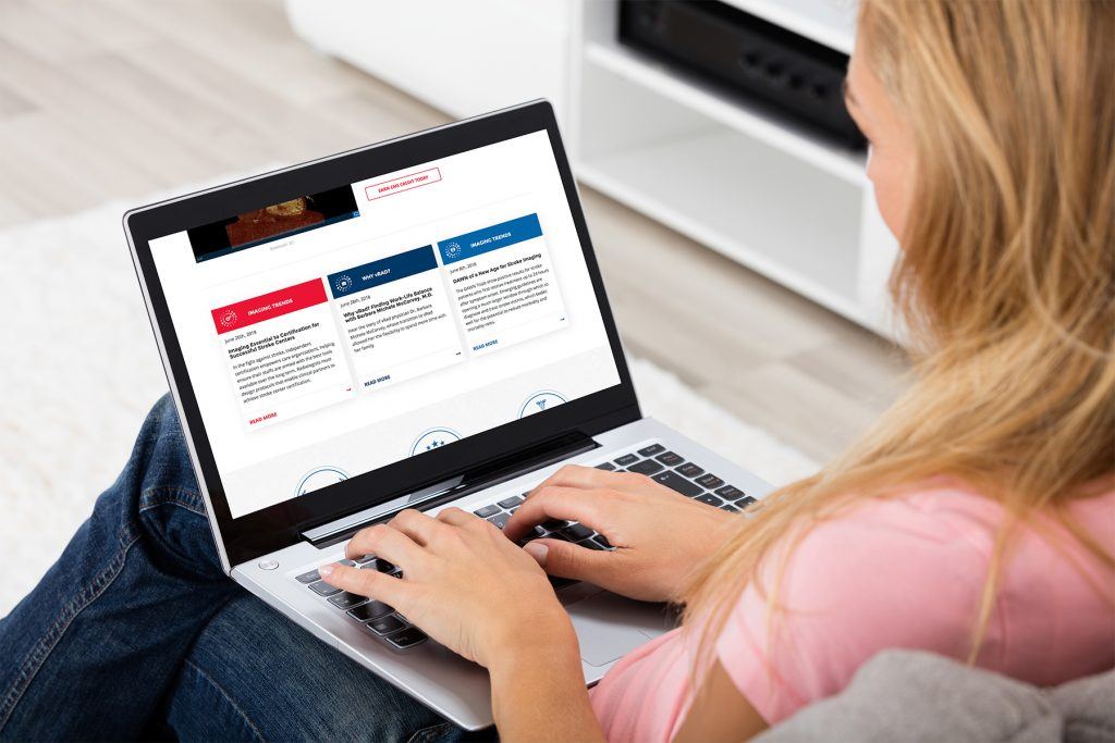
High Angle View Of A Woman Giving Online Survey On Laptop At Home
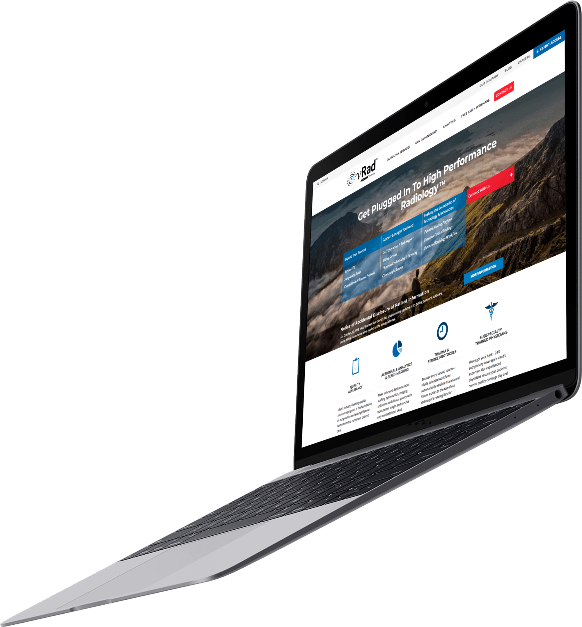
Bolstering Biz for the Nation’s Leading Teleradiology Provider
What do you do when you’re faced with the challenge of crafting a new website for the nation’s leading teleradiology provider? You break down the challenges at hand, prioritize strategies, then completely and utterly execute with quality.
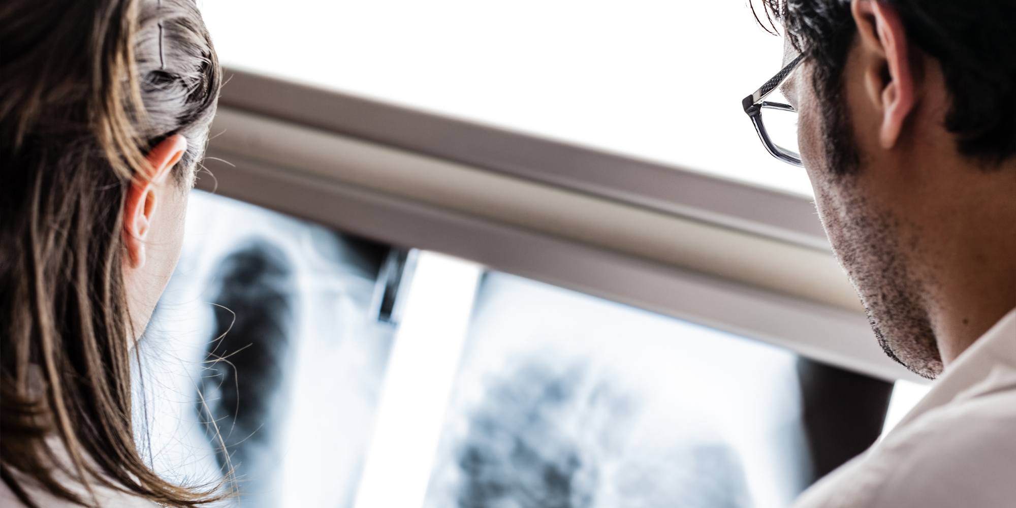
Teleradiology is the business of hospitals sending images—X-rays, MRI results, etc.—to remotely located radiologists who can read them, assess them, and return reports to those who need them in a timely matter. This means emergency rooms experiencing a spike in patients and hospitals enduring understaffing issues or needing an extra pair of eyes on an image have somewhere to turn—any time of the day, any day of the year. With more than 400 U.S. board-certified physicians on staff, 75 percent of which are subspecialty trained, vRad’s depth of knowledge and experience is second-to-none.
More than 2,100 hospitals, health systems and radiology group facilities count on its advanced radiology picture archiving and communication system (PACS). And when it comes to innovation in the realm of telemedicine, vRad is the obvious frontrunner. With 15 patents highlighting innovation in telemedicine workflows in hand, and more in tow for data normalization and deep-learning applications for computer-assisted diagnostics, vRad is pioneering unheard of tech advances for telemedicine to make it simply work better and more efficiently for everyone involved, ultimately resulting in better care for patients across the nation.
The challenge? Make a user-friendly and intuitive website for vRad in order to generate leads.
Our Solution
Telemedicine, Meet Great Web Design When it comes to successful websites, one of the key components is usability. If your website is too difficult to navigate, fosters a poor flow, is a hub of broken links or takes too long to load, users will split. The speed of web navigation today renders confusion or delays that are intolerable to most (unless you’re still sequestered on dial-up island where patience isn’t a virtue, it’s a necessity). This is where Snap comes in: We make websites beautifully usable. A beautiful website won’t only make navigation easier, but it can even encourage users to stick around a little longer, linger for a bit, maybe sign up for that newsletter you write every month.
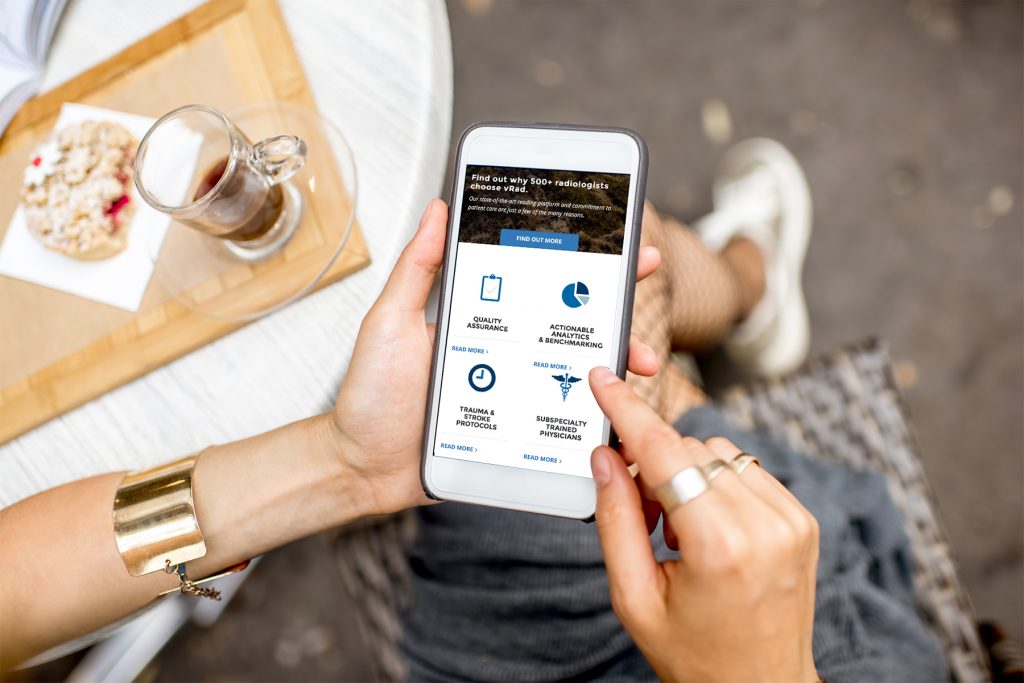
Woman holding a smart phone with empty screen sitting outdoors at the cafe with cake and coffee on the table
Snap had some pretty steep statistics to match from the onset. With a 95 percent satisfaction rate and 99.7 percent reading accuracy rate, we had to create a website that would reflect and amplify the quality of services being provided. How did we do it? Expert designer Brenna French gave me the low-down.
Goals: – Migrate entirety of existing content to new site.
– Design a simpler user flow.
These seem easy enough, right? Wrong.
Challenges: With a website as sprawling as vRad’s, challenges sprang up when trying to regroup content into “like” categories. Like trying to sort 12,000 varied butterflies into like colors, vRad’s web content was tough to group and assemble into a manner that made sense. There was an obvious need for content to be placed in more appropriate areas of the website.
Resolution: As tedious as it sounds, we went through each page and navigational item to compartmentalize the content. We also combed through all of the existing content—even those bits hidden in untouched shadowy corners of the website—and decided if it was important enough to be on the website. When it comes to crafting an authoritative website in your industry, cut the superfluous content. Trim the fat. Don’t give users extra pages they have to skin through if they aren’t valuable to begin with.
How was the client/agency relationship? The client was incredibly detail-oriented—which makes sense for their industry. Sweating the small stuff should always be considered in a web build. Having a thumb on the pulse of details, however, required us to have clear communication and multiple visual designs to ensure comfort and trust on both ends.
How was internal collaboration with other teams at Snap? We communicated throughout the project to learn and discover the value vRad brought to its users. By collaborating among ourselves, we developed a clearer understanding of vRad’s business and client expectations.
How did the site turn out? The site turned out great! We aren’t a smug agency, but we recognize a job well done when we see one. Founded on simplicity and utilizing a super clean design enhances the user experience side of things. “I am excited to be a part of this project because I know that people will be able to get to vRad’s sales lead process more quickly and simply,” says Brenna, the rock star designer I was talking about before.
Was this project like ones you had completed before? Yes and no. Snap has grappled with medical websites in the past, so being met with vRad’s ask wasn’t the first in this industry for us. But while this website was along the same medical vein as ones we’ve done in the past (here’s looking at you, Iowa Clinic), it differed in that the target audience and client goals were different. Same rodeo, different bull. However, both sites were similar in that the previous design was begging for simplicity and content needed to be reorganized in a way that made sense.
What’s the first thing you take into consideration when designing a website for a client in the medical industry? The first thing you always consider is the target audience. Brenna stresses, “At the end of the day, that is who the site is actually for, so I always make sure that is at the forefront of my mind when designing anything.” Medical websites especially have an unspoken responsibility to earn trust. If you’re scouring a website looking for a great pair of shoes, trust may not be as high of a factor for you to make a conversion on that site. It’s just shoes, after all. However, a website in the medical industry must establish trust and the beginnings of a relationship with each user or a conversion simply won’t happen. If the site looks haphazardly built, is full of typos, laden with busted links, or lacks information, then how do your operations run when it comes to patient care? Most users aren’t willing to take that chance.
People are coming to websites in the medical industry to feel better and receive personal care from a doctor’s/physician’s perspective. With that in mind, it’s crucial to sell the outcome of a conversion instead of stress the original problem when designing for a medical website. When designing for vRad, it’s best to discuss the overwhelming amount of great results as oppose to the woes of ailments patients are experiencing in the first place.
Medical Websites Made Easy by Snap Agency Well, almost easy. When coming to Snap for your website rooted in the medical industry, you can expect to be met with confident, considerate and capable designers, writers and more. Together we make your site intuitive, easy-to-use, and compatible with all the screens you can imagine. Getting found on Google is a full-time job, but getting the conversions you want takes the touch of an expert designer and conversion rate optimizer.
Does your medical website desperately need to be rebuilt? Let’s talk today.
Partner With Snap Agency Today
Interested in creating a gorgeous website for your business? Then don’t hesitate to call or message Snap Agency. Our team can provide all of the digital marketing services your organization needs to ensure long-term business success.
We use cookies on our website to give you the most relevant experience by remembering your preferences and repeat visits. By clicking “Accept”, you consent to the use of ALL the cookies. However you may visit Cookie Settings to provide a controlled consent.