What’s the best way to display and sell your product online? First, I recommend you take a quick look at my list of favorite e-commerce websites in my earlier post, 5 Trends we Love.
I’d like to shine the spotlight on Apple and Garmin, because they really focus on the sell. Their goal is to turn researchers into buyers and their website shows it.
First, Apple does a wonderful job catering to those who are “just looking”. It helps that their company has plenty of clout, I’m sure they can get away with breaking the rules a little more than the rest of us can. They have whole pages devoted just to selling their products: the features and design of the product, along with apps and videos to peruse. Apple’s ultimate goal is to nudge researchers into the buying category. When the buyer is ready to click “buy now” they are treated to an effortless interface that minimizes mistakes by graying everything but the task at hand—ensuring the right options are chosen and the product is purchased. Understandably, there’s quite a few pages of options the user has to go through—especially considering the expensive, complex products Apple sells. The upside is, Apple has made each page clear, and to the point.

Garmin is no different: they have beautiful pages with informative graphics that really explain to people how their product works and the value it provides. Perhaps the only downside is that the information pages are extremely load-time heavy. Garmin has the right idea on product “add to cart” page—it is extremely simplified. Product title, an image, the price, and an “Add to Cart” button—all other information about it is below the fold should the buyer need to see it.

These companies are industry leaders in technology and they understand the importance of an informed buyer. The more costly the products being sold online, the more important it is to lessen your buyer’s fears of receiving a product that falls short of their expectations.
Here are some more examples of superb design in Focusing on the Sell
Beyond just Apple and Garmin, you can see that people respond to clear indications of what they should do next on the website. With a clear “Call-to-action” a website is a bit flimsy and people appreciate strong indications of their next step through your companies website.
This call to action creates urgency
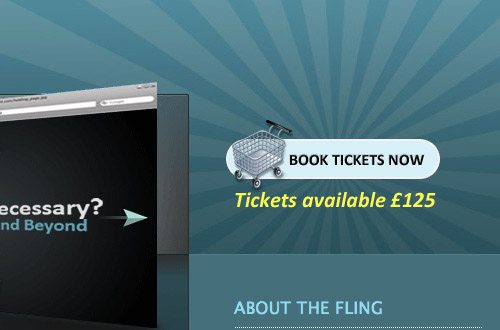
Beyond just giving them a visual for throwing something in their digital cart, you can mention that there is only a limited number of this item left. Give them a reason to by now with your visual and text cues. Is this item only available for the next six months? Limited-time only comes to mind as a clear way to draw their attention to the present moment.
Don’t be afraid to give them a couple clear choices
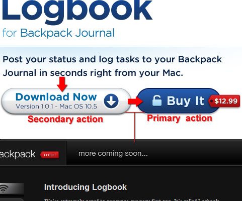
This is an example of a primary and secondary call to action, getting people to buy on an E-Commerce site. You could have them learn more about the product or purchase it now if they already know enough. This way you can cater to each of your e-commerce sites type of visitors front and center on the website with big beautiful and/or in your face buttons. Keep in mind what the primary goal of the site is, and make sure to “Always be selling”. You’re not doing yourself or your website visitors a favor by making their next step confusing or hidden. Keep it front and center and your conversions will thank you.
Check out our full guide on ecommerce web design. In it you’ll find wireframes for common ecommerce page types and helpful tips for design a site that converts!
If you are selling premium products online, consider hiring Snap Agency. We have a long, rich history of building and managing e-commerce stores, including five of our own brands. Discover how our experience can help you today. Give us a call at 763-548-2297 or email us @: go@www.snapagency.com