Software as a Service (SaaS) really does it all—document editing, instant messaging, email, payroll, business analytics, etc.—and that’s exactly why we love it. After all, where would we be without applications like DocuSign, Mailchimp, Evernote, and Dropbox?
However, we’ve noticed that web design can be challenging for companies that boast such versatile software. We’ve talked about SaaS marketing before; today we’ll focus specifically on simple, actionable ways to develop a superior website design for your SaaS business. If you want users to see your software as the workplace essential and industry necessity you know it can be, read on.
1. Give Your Site Some Personality!
From 2010 to 2015, we saw 1,400 SaaS sites appear, and that number has only grown exponentially. In a sea of solutions, your web design needs to stand out more than ever before. Of course, we love a sleek, minimalist web page (what digital marketing agency doesn’t?), but what if you want to take things further and give your site that extra oomph?
Many SaaS companies avoid getting quirky precisely because they’re worried they’ll miss the mark—in other words, that they’ll come across as “too weird” or niche. But if your software has the data and the testimonials to back it up, we encourage you to be bold and have fun with your marketing. The confidence you have in your product will shine through even more as a result. To get started, isolate your brand voice and brand positioning strategy. Next, it’s time to envision how the things that make your product and company unique might translate to the actual design of your website, whether through text or color palette.
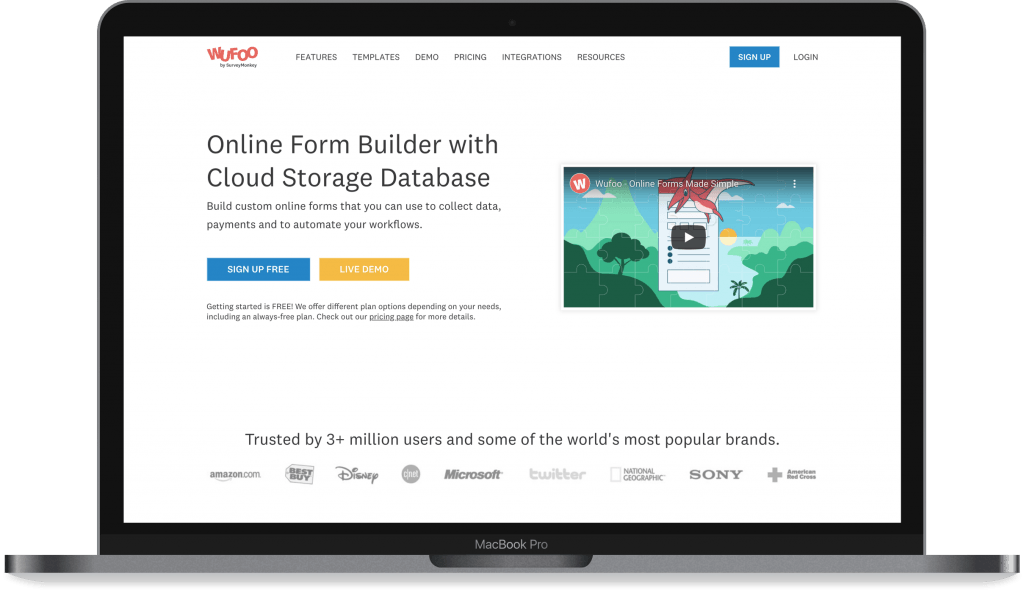
Web Design Done Right: Wufoo
Wufoo by SurveyMonkey is high on our list of excellent web design examples for SaaS. This online form-building software is, after all, as charming as can be! Take a look at those dinosaur mascots, for instance—they appear in videos, sidebars, and banners throughout the site, making the user experience both whimsical and minimalist.
Now, personality is expressed through image choice, yes, but word choice can be just as important to the perception of your site. We adore Wufoo’s delightful turns of phrase (“customize [forms] to your heart’s delight” and “we’re like a choose-your-own-adventure novel,” for example). And the fact that their articles have titles like “3 Form No-Nos” is pretty dang cute, if you ask us. So if you’re worried that you’re getting a little too “out there” for your target customers, rest assured that you’ll find success by leaning into your unique digital voice!
2. Don’t Intimidate Your User
Of course you want your SaaS web page to look professional, but place yourself in your user’s shoes. Incorporating a new piece of software into a company’s day-to-day operations is no small task; the last thing your users want is to feel even more overwhelmed about the whole SaaS-choosing process. If you’re a web designer worth your salt, you’ll avoid mind-numbing blocks of text, dozens upon dozens of links, and obnoxious sales pitches at all costs.
Web Design Done Right: Petal
Whether your Saas marketing strategy is aimed at businesses or targeting consumers directly, you could take a leaf out of this next example. Upon first glance, Petal sure doesn’t look like a banking website, but that’s why we love it. Think of how nerve-wracking acquiring a credit card can be on your standard banking site. The process of obtaining a Petal card is anything but.
So, what’s the secret? The pastel color palette, for one. Just looking at those pale yellows, blues, and greens is like an endorphin rush straight to the brain. And then there’s the typography, of course. Those clear, rounded, evenly-spaced letters are oh-so-pleasant to read, and the text doesn’t clutter the screen. As a scenic-sounding name like Petal would suggest, their whole web-browsing experience is like a breath of fresh air.

3. Create Varied Content
We’ve touched on varying your color scheme (while still keeping it cohesive, of course). But if you really want to keep your customers engaged, you should change up the substance of your site to follow suit.
What does “varied content” look like for an SaaS platform? A nice variety of pictures, videos, and interactive tools, for one. Blog posts, customer testimonials, narratives, case studies, illustrations . . . the list goes on. What content would speak best to your audience, and have you established a regular posting schedule for said content?
If you’re still getting started on the content marketing front, we recommend ensuring your homepage and product pages are up to snuff before setting your sights on further copy. You’d be shocked at what a well-designed and well-written page can do for lead generation.
Web Design Done Right: FullStory
FullStory promises “everything you need to know about your digital experience,” and given their diverse media, we’re inclined to believe them. Demo videos, graphics, quotes from satisfied clients, and blog posts abound, without any of it ever feeling like too much. Not to mention, they have a bunch of other social media platforms—Facebook, Instagram, Twitter—with similarly varied content. It sure makes us want to learn more!

Looking for Even More SaaS Insights? Team Up With Snap Today
Your end goal as an SaaS company is to turn casual visitors into leads—and let’s face it, you can’t do that without making a compelling first impression. That’s where killer web design comes in. And we believe we’re the award-winning agency for the job.
Have questions about how best to vary your content—and how to do so regularly, at that? What about creating an approachable browsing experience for potential customers? Or maybe developing a homepage with heaps of personality? We know how to do all of that and more. Contact Snap for that SaaS site revamp you’ve been waiting for!