Medical and Health web design inspiration takes a little bit more work to find, and so I’ve curated some examples that I think can serve to inspire our team or any designers out there that are looking for ways to show creativity in an industry that requires a little more ingenuity to make look fresh considering the restraints.
One Medical – Medical Group Web Design
With quite a bit of color, clean strong typography and simple and significant use of white space, One Medical’s website hits a lot of high points. The full width video header tells their story visually, and the subtle patterns and powerful colors don’t hide under your typical medical blues. They stand out and grab your attention and create an impression of being full of life and health.
Passion for Excellence Web Design
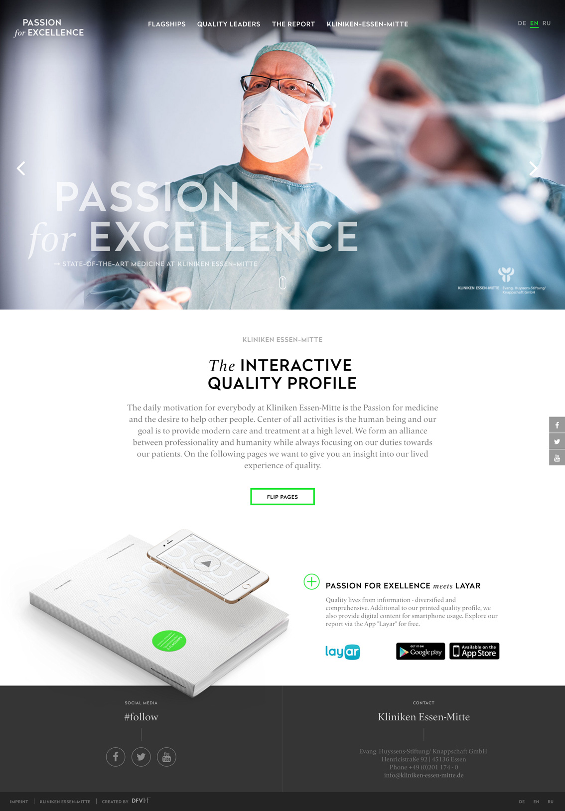
I love the strong simple typography on this design, and the way the book and application are presented it makes the design feel comfortable and clean. The way this website is presented, I can only imagine the organization it represents is professional and has state of the art technology. The visual design of a medical website is incredibly important and speaks deeply to how clients, customers and patients will perceive your company.
Medical Web Design Theme – MedicPlus

I will say this feels like a simple, but state of the art medical website. There’s nothing wrong with a prototypical, modern approach to visual design when it comes to medical design. Notice some of the intricate details in this design, like the icons in the contact information, or the way the large top of the footer is still highly visual. Once again the multi-colored elements make the website feel alive and vibrant, keeping away from sterile. Web design inspiration for a medical or a healthy company, is half just about staying away from sterile – but blue does work well and giving the appearance of clean leaves a very professional impression. Notice how much white space this design uses, as the designer didn’t cram as much content into open spaces as they possible could.
PreBiotin – Prebiotic Supplement Website
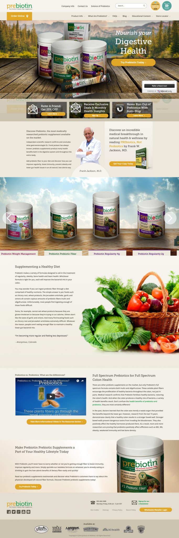
Breaking into some green and yellow, this is of course for a health product not necessarily a medical website. I would say the tan colors play well to the product packaging design, although I would have played down the shadowing on the front of the products themselves. In the end you want the product to be the star in an eCommerce store. The call to action buttons and ‘trust factors’ on this site do present the case for the product well and offer some possibilities to really get a full view of the story.
Lexington Medical Web Design
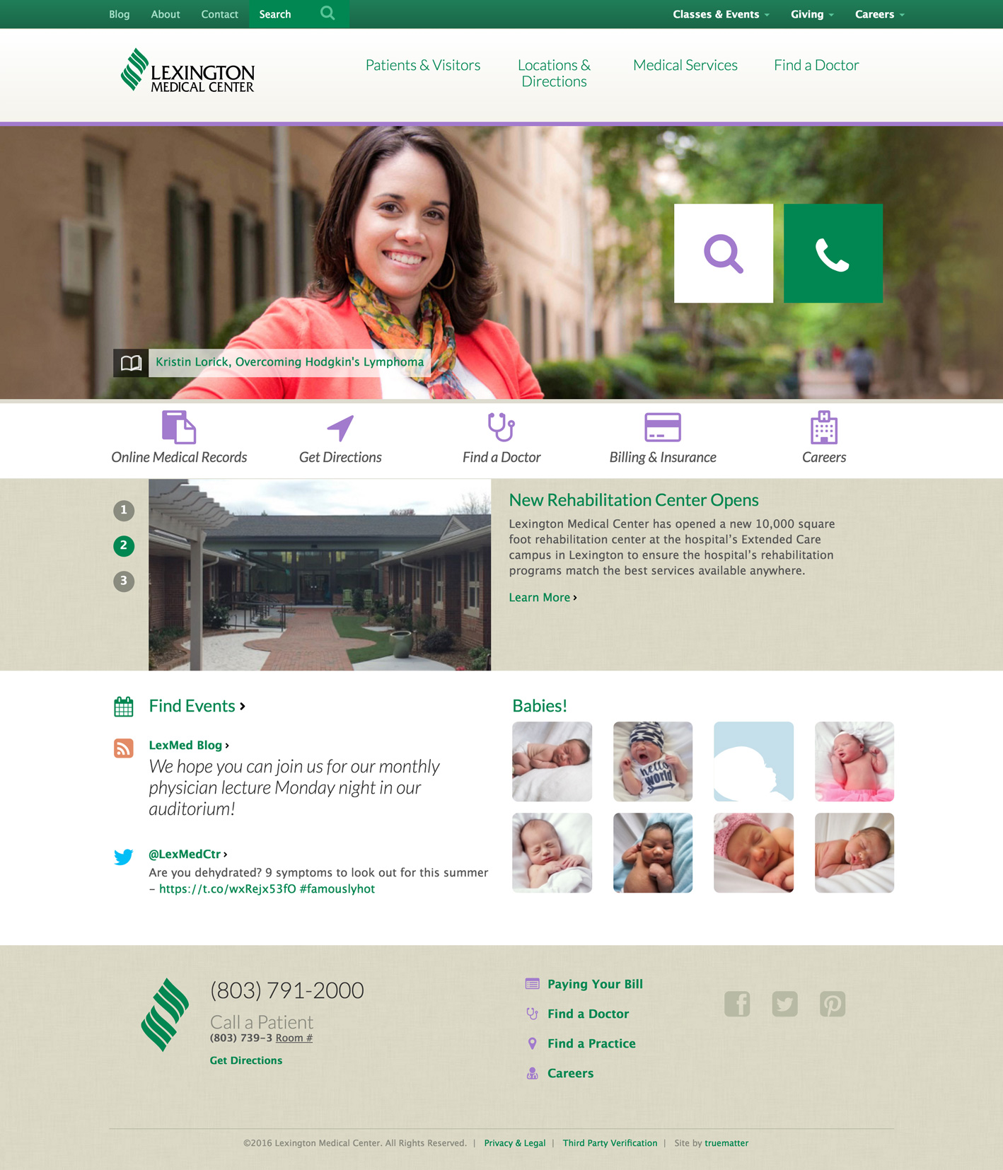
What I like about this medical industry website is the somewhat unusual color scheme, the icons all have a cohesive and branded type feel, and the creative use of the search field (which animates out if you click it,) and the phone icon button for quick and obvious action when you land on the site no matter what device you’re on.
Helsenorge – Quit Smoking Web Design

You really have to visit this site to get the full picture of how cool it is. I would say this type of design isn’t appropriate for most medical or health websites, but it could be awesome for an initiative like this one or an event. The animations make the website feel alive and dynamic.
Integra – Web Design

A ’boutique’ health clinic, that takes a creative approach to their website design. Well, perhaps it’s nothing insanely innovative, but when something feels this clean and composed – it gives a highly professional and almost innovative impression. Things I love; the iconography and subtle grey lines in the second and fourth example, and the patterns used to add accents. The branding of course is part of that feel and the attention to the footer gives a perfect bottom frame to the site. Footers are under-rated.
Fitbit Web Design
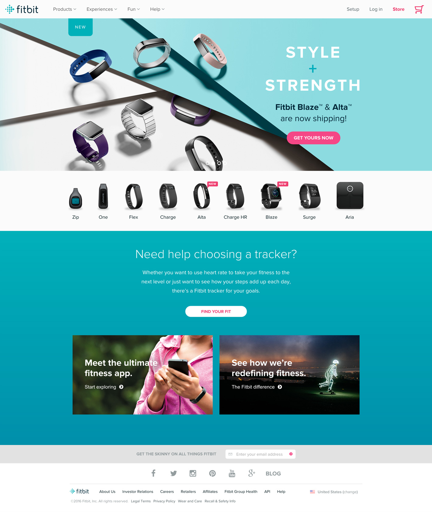
Clearly the kind of capital that would go into building an epic website for Fitbit would be high seeing as it’s a B2C website and so much of its business depends highly on the impression of quality on the site. The blue gradient is delicious, the smorgasborg of products that feel like they are photographed all together, and particularly the top image stand out as clear high points. That powerfully and masterfully composed photo demonstrates obviously how much good photography can do for a website design. Photography can make or break a site.
Shapeup Web Design

Once again icons, white space, and a bold color scheme play a strong role in the site’s visual appeal. This fodder for medical web design inspiration also features great use of shapes to frame elements within photos, and a tasteful use of rectangular blocking throughout the key content elements.
DMC – Health & Healing Website
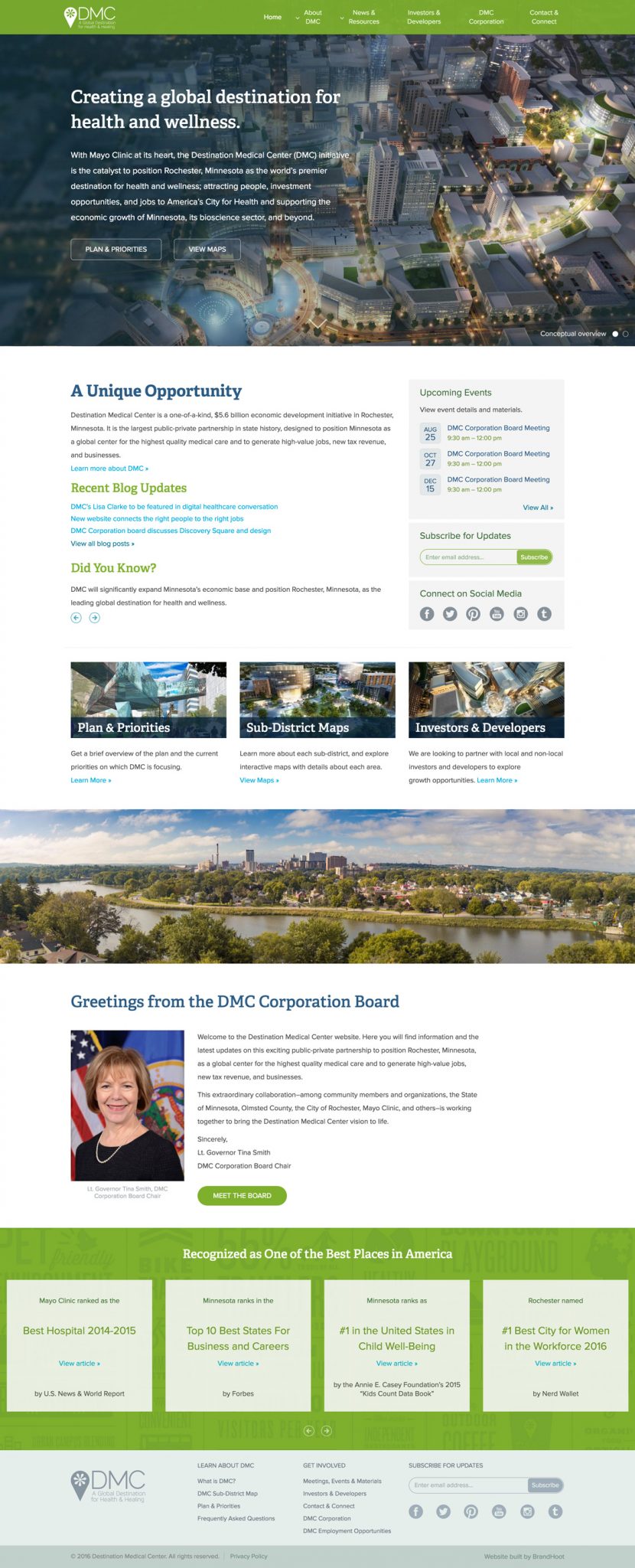
Great Medical Website Design in Minnesota – where we hail from, for DMC Health and Wellness. It’s definitely easier to keep a website’s color scheme cohesive when you use a grayscale + 1 approach. I love the dynamic carousel blog area to feature fresh and recent content on the site, the DMC as part of Mayo Clinic also showcases recent events and the mixture of white space, green and aerial photography keeps it consistent throughout.

