Two pioneers of web design usability Don Norman and Steve Krug helped me understand why putting things where people expect them is important. The core of usability is making things easy to find and interact with.
The emphasis in Norman’s and Krug’s view of creating effective online experiences is creating clear hierarchy and emphasis, but what do they have to say about making things visually appealing? Where does taste, simplicity and aesthetic sensibility play into making things easier to interact with?
Don Norman, Godfather of Modern Web Usability put it this way;
“Positive affect makes people more tolerant of minor difficulties and more flexible and creative in finding solutions. Products designed for more relaxed, pleasant occasions can enhance their usability through pleasant, aesthetic design. Aesthetics matter: attractive things work better.”
So we have a very scientific-minded person giving credence to a seeming “halo effect.” The halo effect was originally coined back in 1920 by psychologist Edward Thorndike who asserted that people let the “positive effect” of different realtors affect their overall perception of realtors. In this research, attractiveness influenced how the observers viewed the rest of the realtors’ other personality qualities. It was determined that attractiveness affected how good the observers thought the realtors would be at selling a house. Do we have other cognitive bias which affect us? Do we assume if one visual facet of something is good, the rest of it must also be good? While the halo effect refers to how humans perceive one another based on aesthetics, does the same inevitably ring true for the inanimate?
It comes down to the fact that if people like what they see, they assume the best. If a book has a beautiful cover, they might assume the writing is fantastic. And, conversely, if they don’t like what they see, they might assume the other qualities are equally dissatisfying.
Steve Krug, guru of what we refer to as user experience said;
[bctt tweet=”“Get rid of half the words on each page. Then get rid of half of what’s left.””]
Before I get stoned by the SEO people here, the truth is we often serve up more than one human being really wants to read, so it’s a matter of tucking the other copy away in a place that doesn’t obligate a person to have to ignore. Or, at least, make it very clear what the main points are and don’t tuck them in a wall of text.
Steve also suggests to get rid of “happy talk,” and “all instructions,” as every main action on a page should be extremely clear.
“If we find something that works, we stick to it. It doesn’t matter to us if we understand how things work, as long as we can use them. If your audience is going to act like you’re designing billboard, then design great billboards.”
The emphasis is always on hierarchy in Steve’s estimation, and for that reason there’s a lot less on the value of visual appeal. But if the hierarchy of information and navigation is clear, the main points are not drowned in unnecessary text and if given their proper white space, you’re basically half way to what could be considered a well laid out and visually appealing web page anyhow. Combine this clear hierarchy within elements of text with an appealing or striking image as you would see on a billboard and we’re 75% of the way there.
Dimitry Fadeyev, a web designer who has worked on both Facebook and Digg, puts it this way;
“Good design at the front-end suggests that everything is in order at the back-end, whether or not that is the case.”
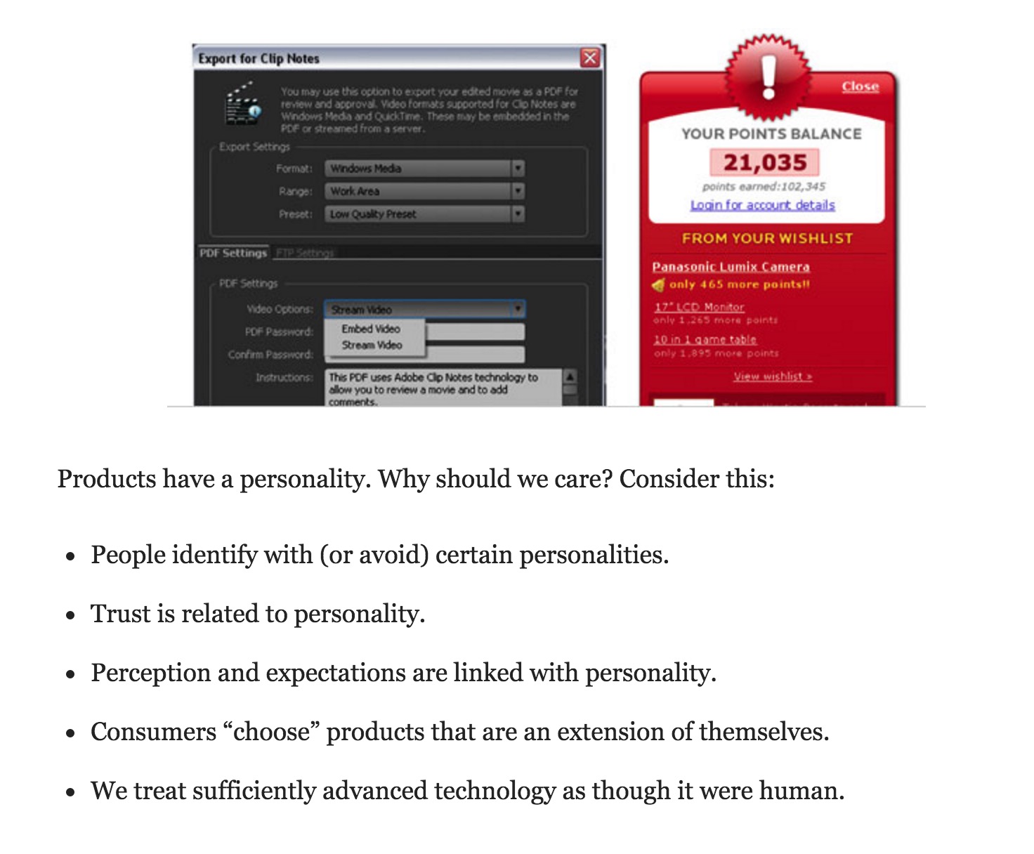
Stephen Anderson in his article “In Defense of Eye Candy” says that products have personality. Which of these interfaces is friendlier? Which seems more professional?

We make decisions about who we want to be around whether they are loud, quiet, friendly, professional, obnoxious, unforgiving or understanding. Why wouldn’t we do the same for the web applications and websites we choose to interact with? For many of us, this means if our website doesn’t seem to be particularly enjoyable to be on, perhaps working with us won’t be either.
Why would I do business with a company that has a visually unappealing site?
When there’s another company that has a visually appealing site.
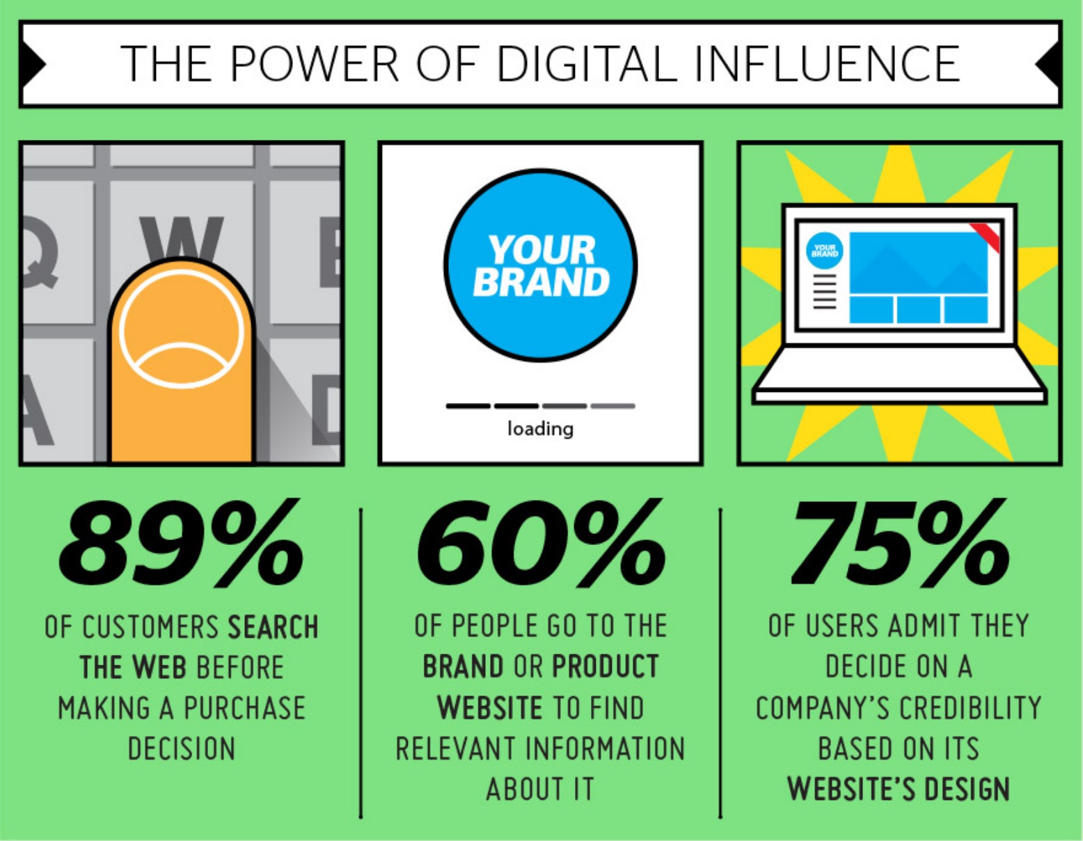
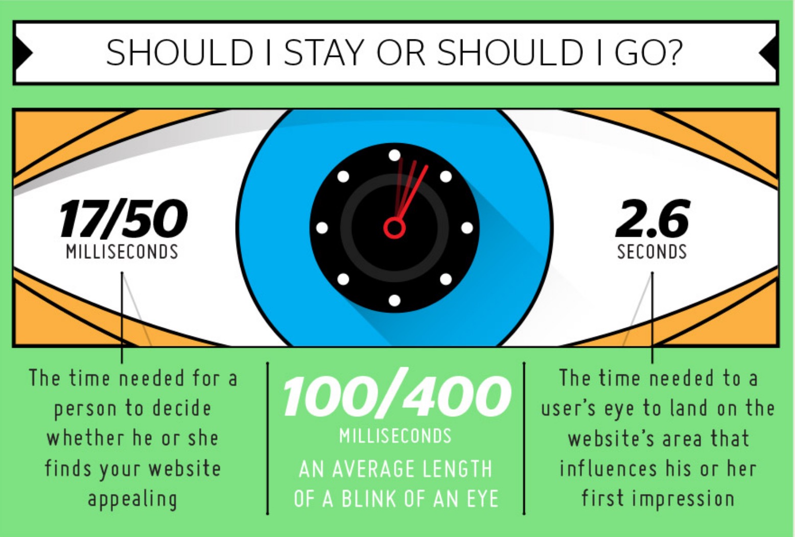
Many people attribute aesthetic elements to the quality of your product or service however fairly or unfairly. Making a user-friendly experience is affected by seemingly inconsequential elements of a visually appealing design. Because you know what? People make a judgement about whether they deem you a high-quality company, or the type of people they want to do business with, within seconds.


