If you were to ask our UX/UI Designers why color scheme matters so much on a website you’d be in for a very long answer. A color scheme is an essential part of your company’s foundation. At Snap, our Designers have helped hundreds of clients create website color schemes that best suit their wants and needs. But why exactly does a color scheme matter so much on a website?
Site Hierarchy
 Many assets contribute to your site’s hierarchy, and color scheme is a major player. A color scheme is a way of visually structuring your website in a way that naturally and unobtrusively guides a user through your desired conversion funnel. Whether that’s leading a user down a page or to a call-to-action, colors are a natural way to direct the eye and mind.
Calls to Action
A call to action (CTA) that fades into the background is one that will underperform. But a specialty colored CTA can catch the eye and prompt conversions. By keeping your CTAs within your pre-existing branded color scheme, you keep your CTAs from feeling untrustworthy.
Brand Compliance
For a user, nothing is more frustrating than not being able to tell if the website you’ve landed on is the one you’re looking for. Creating a color scheme that can be used across your website as well as your entire traditional and digital platforms helps to ensure that you are adhering to your branding guidelines in every space. A color scheme helps a user to identify your brand on sight, potentially leading to increased brand loyalty over extended exposure.
WCAG Compliance
While not mandated, many companies seek to achieve WCAG (Web Content Accessibility Guidelines) compliance to benefit their customers. Typically, eCommerce companies or those within the healthcare sector tend to be the leaders when it comes to WCAG compliance. There are many aspects that make up the WCAG system, but your color scheme should be created to address the distinguishable portion of the perceivable section with the guidelines. This portion of the WCAG covers, among other things, use of color, contrast, and visual presentation.
Color Psychology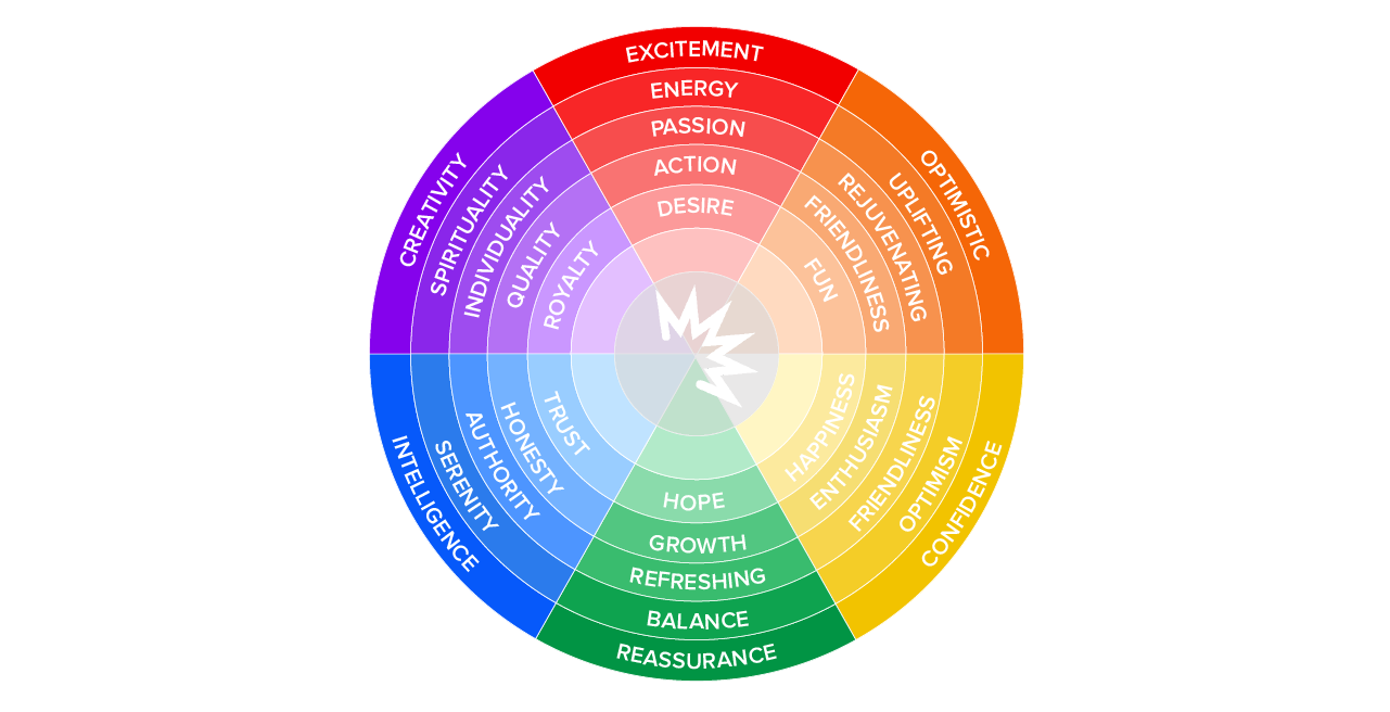
Color psychology is a fascinating topic to explore. You may think that your color scheme should be chosen based off your favorite color, but data suggested that you’ll be more successful appealing to your target demographic by utilizing some color theory and psychology best practices. For example; did you know that 93% of shoppers place visual appeal and colors above other factors when shopping?
Data has shown us some interesting truths when it comes to user preferences. For example, research suggests that men prefer blue but don’t like either brown or purple, while women love purple and blue but don’t like brown and orange. Additionally, it has been shown that older audiences prefer blues while younger people like green, with younger demographics disliking orange and harsh reds. The role of color psychology in digital marketing and branding is a fascinating one.
Our Designers rely on some free tools to help them create the best color schemes possible. Here are just a few of their favorite handpicked free color scheme tools.
Coolers
Coolers is a great free tool that we use frequently. This tool lets you shuffle between different color schemes to find inspiration or narrow down your choices. While switching between the samples, you can lock one or more colors and then continue to shuffle until you find the combination that works best for you. The best part is that the hex values are always displayed with the profiles for ease of use. Each color is fully customizable, and you can keep on switching until you find the perfect combination for you. The platform also offers a host of additional features that make finding your perfect color scheme a breeze. Start from scratch or build off of an existing brand color; the choice is yours.
WebAIM
A serious consideration that all designers have to keep in mind is WCAG. WCAG stands for Web Content Accessibility Guidelines and governs what is and is not accessible to those with visual impairments. WebAIM aims to help designers choose designs that are compliant with WCAG. This site can test your website to evaluate if it’s accessibility for those whom are color blind or otherwise visually impaired. It does so by testing the color contrast of your site to ensure that computers and humans alike to read your text.
Rgb.to
There are many situations in which you may find yourself needing to turn standard publication assets like brochures or business cards into digital assets. If you find yourself in this situation, finding the Pantone color to convert into a hex color can be difficult. New Pantone colors are released every year while others are simply reclassified or renames. Rgb.to will turn any Pantone color into your choice of RGB, CSS, HSL, HSB, hex, and more.
Refine Your Color Scheme with Snap
There’s more to a color scheme than most realize. And if left unoptimized, you could be missing out on any number of opportunities to attract potential customers. In a world where first impressions count, having a color scheme that clashes with your corporate goals could prove to be a severe hindrance to your digital success. At Snap, our web design team can make sure that your brand is putting its best foot forward by making you a custom color scheme today.